I don’t know about you, but I thought the Barbican in London was simply an arts centre – “simply an Arts centre” there’s an understatement for a start. Just how wrong can you be?
 My wife, Sue, knowing I like Brutalist architecture bought me a ticket for a guided architectural tour of the ‘complex’ and complex it is.
Not only is it an arts centre – by the way, this section of the development was finalised and built last – but it is a housing project comprising around 2000 flats.
First, throw away all preconceptions of what a ‘housing project’ of this size would look like. The project was conceived in the late ’50s by architects, Chamberlin, Powell and Bon. They planned and delivered a high quality, wonderfully detailed living space, and due to the management of the terms of the letting or sale of the units, it has remained so ever since. Strict conditions apply regarding what the occupants can and cannot do – but I’m getting in front of myself.

The church of St Giles without Cripplegate, one of only 2 buildings left in the area after the blitz. The stonework in the foreground is part of the remains of the original Roman fort.
If I may backtrack; The area of CrippleGate in the City of London was bombed during WWII. Many lives were lost and most buildings in the area were destroyed completely or were beyond repair.
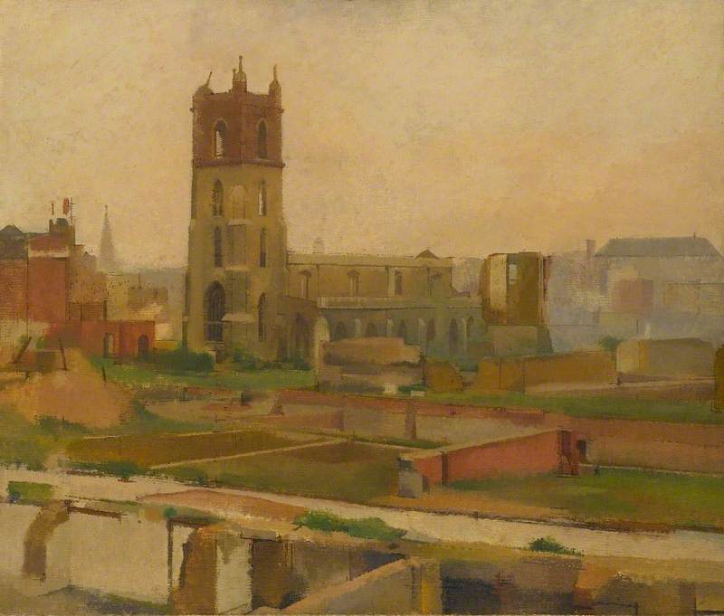
Cripplegate after the blitz painted by William Menzies Coldstream
After the war, in the late ’40s and ’50s plans were made to re-build and to repopulate the area. Chamberlin, Powell and Bon were asked to submit plans for the Barbican – they were building the nearby Golden Lane Estate. Construction began on the residential blocks in 1963, the Barbican arts centre followed some time later.
The architects eschewed the label of “Brutalism” for their designs, although there are many elements of Brutalism in the concepts and delivery of the architecture. Their choice of a less than formal Brutalism allowed them the freedom to soften the structure – as in the Conservatory where the use of planted areas soften the raw concrete Fly Tower of the theatre rising from below.
The simple yet effective, startling even, technique of designing the project ‘Inside Out’ as it were, where flats faced inwards on to large courtyard gardens and planted areas, give the whole thing a hidden, secret garden feel. My first thought on entering was “This is not what I expected”. Look at the pictures and judge for yourself.
To an ex-construction surveyor/engineer like myself, this is a polished jewel of craftsmanship. The detailing achieved by the architects pervades from the massive and grand scale of the structure down to the human level where you ‘touch’ excellent craftsmanship and fine (and expensive) detail. These are not buildings where money has been spared.
I won’t bang on about the quality of the concrete work or just how unbelievingly difficult that was to achieve. No matter what you may think ‘concrete is not just concrete’. Yes if it’s structural and is going to be covered you can be less careful about what it looks like but when it’s all exposed like this… just getting the colour consistent is a major problem for the mixing and pouring gangs. What they achieved is no mean feat I can assure you.
“Just getting the colour of the concrete to be consistent throughout the project must have been a major problem”
OK… you may not be interested in the technical aspects of the construction – or how the engineers maintained consistency in the concrete, just don’t take the process for granted. What has been achieved here is a masterpiece in design and execution, a monument to excellence in the ability of the architects and workforce alike. Just stand in the spaces. You will understand.
“Book a tour. It really is worth it.”
As for buying one of these apartments, and I would love to, the ordinary man would have to win the lottery. They are hugely pricey (£1million and up) – though apparently, you can rent, though even to do that is eye-wateringly expensive I understand.
TO DISCOVER MORE…
There are a couple of good web sites to see…
1. First, to book your ticket – AND YOU REALLY SHOULD – go here…
https://www.barbican.org.uk/whats-on/2019/event/architecture-tours
2. And if you want to look inside the flats… well, you can’t, not physically anyway, but this excellent site takes you inside some of the flats and meets the residents…
Barbican residents
A visit to the Barbican is a must for anybody interested in post-war design.
PICTURES

The brick building in the near distance is, in fact, a concealed stairwell between the car parks below and the podium level.
The semi-circle design device used again around an outdoor performance area, which is itself the roof of the interior performance area below.

Smooth Terrazo and hand roughened tooled concrete textures in the circulation areas of the Arts Centre.

Subtle, sophisticated detail used in the Terrazo finishes to walls and floors in the men’s toilets

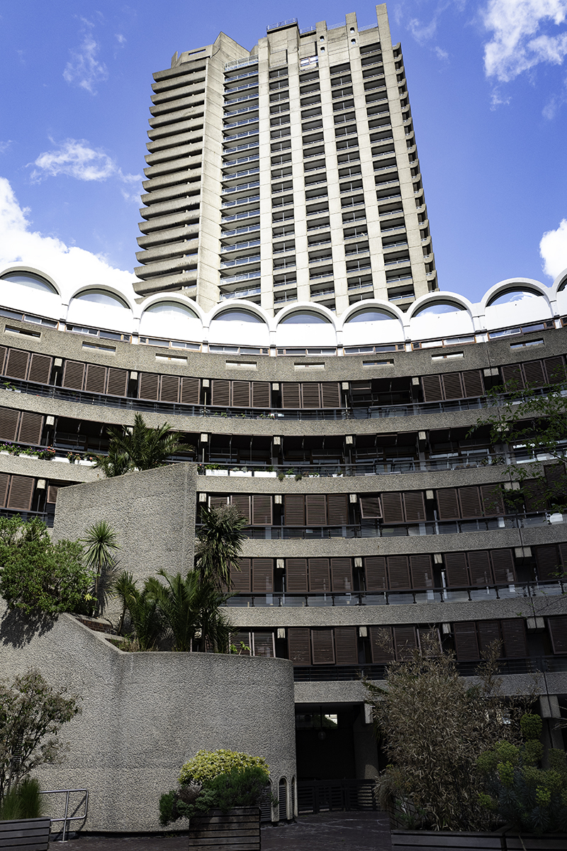
Elements of Brutalism are used in all three towers (one 43 floors and two 42 floors)
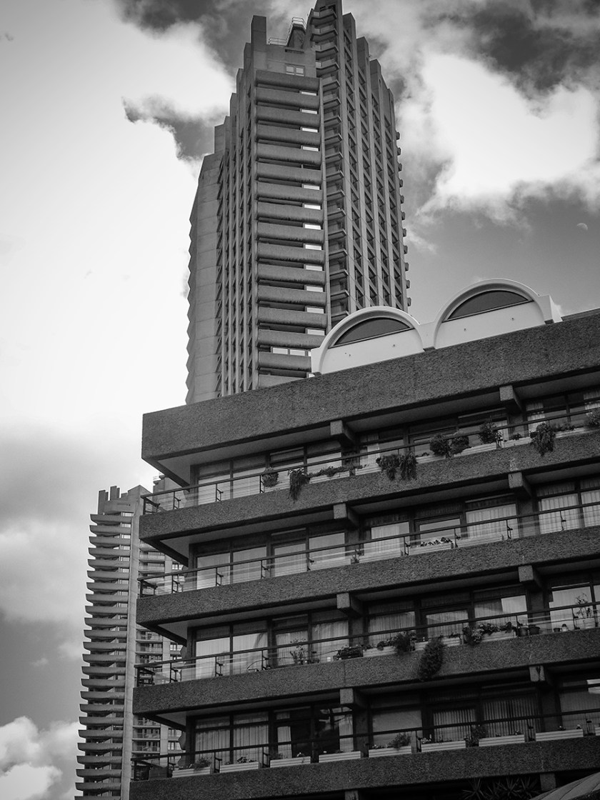
The recurring use of the semi-circle reflecting the shape of the old Roman fort

Elements of Brutalism are used in all three towers (one 43 floors and two 42 floors)