Latest Posts

image credit; Laura In Black Oil on Linen 508 x 406 20/09/2015 © Joshua LaRock

Exhibition Review: BP Portrait Exhibition

It’s rare we here in Lincoln, in the east of England,  get the chance to see the results of a prestigious, International competition and award. We tend to be a bit of a backwater where the arts are concerned.

If you are minded  to view international portraiture at it’s best now’s your chance. And it’s a rare and fleeting chance at that. Running from 12th September to the 13th November 2016 the BP Portrait exhibition is being hosted in the Usher gallery in Lincoln city.
Read More

Vest Pocket Autographic Kodak (VPK)

vpk2
The first of the soon to be ubiquitous cameras using 127 film, the Vest Pocket was Eastman Kodaks best selling folding camera. 1,750,000 (some say more) were made between the years 1912-1926. This particular camera was made around 1919. It’s not a very good example of the camera. It’s very far from mint. I suppose that’s OK though as I paid only 30 pence for it at a car boot event 30 years ago.

Supposedly one of these cameras went to the top of Everest with Irving and George Mallory. Though Mallory’s body was found in 1999 there was no sign of the camera which would have had the missing proof Irving and Mallory were indeed first to the top.

The British Journal Photographic Almanac said about the camera…

“In the very excellent design and finish of the apparatus we see the familiar determination of the Kodak makers to produce always the best type of a given article. The Vest Pocket Kodak, though taking a very small picture, is nevertheless a thoroughly reliable instrument, and not at all dear at its price of £1 10s (£1.50).”


Navvie Birmingham

Four connected portraits.

I have chosen 4 of my pictures, all of which are over 40 years old, in order to show ‘related’ images. Odd you may think, but this choice reflects my desire to return to what I saw then. Not what I actually saw, you understand, but more my ability to see something else.

Yes, they are out of focus. Yes, they are grainy. Yes, they may have been treated with a heavy hand when scanning and printing. All of these are faults by modern day standards. And yet, for me,  these images manage to contain some of what todays ultra-sharp, perfectly exposed and wonderfully printed images lack, That ‘Je ne sais quoi’ that I’m struggling to regain.

Perhaps it’s the magic of time passing which has provided that curious, mysterious essence. Or maybe it’s just that these characters aren’t around anymore; disappeared from our more homogenised society. Who knows.

It goes without saying they were shot on film. All Black and White. One, the Navvie, was shot on 6×6 the others on 35mm. And all were shot in my home city of Birmingham during the latter part of the 1960’s – early part of the 1970’s which was undergoing massive change at the time with slum clearances and new build.

1. Harry McGill

1. Harry McGill

2. Boy at Birmingham fairground

2. Boy at Birmingham fairground

Boy with ribbon. Birmingham.

3. Boy with ribbon. Birmingham.

1. Harry McGill from Blantyre in Scotland. Harry was a “gentlemen of the road”.  He was staying in a hostel nearby in Camp Hill, later to be the subject of a Don McCullin piece on the homeless. We talked for a couple of hours before I took his picture. He told me he shared his hometown with Dr. Livingstone, the explorer. He was wistful for his South Lanarkshire youth.

2. One of a group of youths at a fun fair on waste ground at Hay Mills. Faraway look on his face surrounded by noise and flashing lights. Peace amidst the mayhem.

3. A street urchin playing on slum clearance land in Aston near the city centre. He and his friend had a piece of red ribbon pinned to their clothes. I’ve never been able to discover the reason. It has always puzzled me. They both had shoes on their feet. At the time in the late 60’s, it was not uncommon to see street kids with no shoes or socks. Barefoot in all weathers.

Featured image at page top. One of the last of the true Irish Navvies* working in an underground service duct near to the present Aston University. Navvies were a dying breed back in the early 70’s, Long gone now.

*Navvy is a shortened form of ‘Navigator’ as it was these Irish Navvies who dug, by hand,  the pre-railway canals up and down this country. And ‘The Navigation’ was the 18thC name for the canal system. In Birmingham, we just called it “The Cut”.

Peter Barton

Lincoln 2016

Vernak camera made in Birmingham.

Don’t Talk Cameras. Use them.

I saw a small piece recently that had a clip by Hunter S. Thompson on focusing too much on the “technicals of photography”. You can read it for yourself here…

But this is the element which chimed with me…

“When photography gets so technical as to intimidate people, the element of simple enjoyment is bound to suffer. Any man who can see what he wants to get on film will usually find some way to get it; and a man who thinks his equipment is going to see for him is not going to get much of anything”

I’m probably going to upset colleagues when I say…

“Don’t talk cameras. Use them”.

I admit to once being beguiled by the  equipment. Still, today, I collect cameras – of all types. I have dozens but I’m not really interested in them photographically. I just like old cameras. I shall be putting a few up on this blog from time to time just to share my obsession and to show, by comparison, I suppose, where we have come from and how we got here. I digress…

Photographically I have 2 cameras I take out with me. 2 German digital cameras. That’s it.

Both of my cameras are black. Utterly so. I tape over everything I can which isn’t black. I’m not interested in logos.  I try to be as unobtrusive as I can be when I shoot. I’m happy if I am not seen at all – except when taking a portrait of course.

Neither camera is an SLR – I sold all of my SLR gear last year after lugging it around the far east. Too heavy. Both cameras are  mirrorless and digital.  Film is of little interest to me;  any more than driving a noisy, smelly, oily vintage car would be.  Stylish yes.  Nostalgic, definitely and I appreciate both those elements – and much as I enjoyed nights in the darkroom… we’ve moved on.

It’s not about what you use to capture what you see. It’s about being able to capture what you see when you see it. And that’s about the long and short of it. The image content is the thing. The camera is only incidental to that and the image content will not be improved by using film either. It’s just an affectation. Afterall, you’re probably going to scan the negative anyway.

And if you want to talk cameras join a photographic club. There will be plenty there who will be delighted to engage with you.

Remember…  Don’t talk cameras.  Use them.

And as they say in wrestling circles… Seconds away.

Peter Barton.

Practicing photography; still trying to make a decent fist of it.

Book Review: Retrospective. Phil Cosker

Photographer: Phil Cosker
Book title: Retrospective

Size: 250mm X 210mm X 18mm (Landscape format)
Images: 128 pictures each sized 210mm X 140mm
Weight: 906g
Dust cover?: No
Boxed?: No
Loose Print included?: No
ISBN: 978-1-36-726937-8

Purchase price: £45.00.

Described as a ‘retrospective’, Phil’s new book spans a 50 year period up to the present day. Beautifully observed pictures from a half-century of looking.

The images in the book currently (Late 2016) form a series of exhibitions throughout Lincolnshire; some grouped together, like the ’Snaps’ Exhibition at the Sam Scorer gallery in Lincoln, and others on their own, printed large, very large even and exhibited in churchyards around the county.

Phil’s work comprises both black and white and colour  images derived from film and digital cameras, though the landscape pictures were made with an  old half plate camera using glass plates, demonstrating  the detail you would expect from that medium.

I visited the exhibition in Lincoln and have so far been to 3 churchyards to see the landscape images.

The landscape images when rendered in the book have a different, and for my eye, a better and more appealing contrast than the large physical images in the churchyards, striking though those are. I particularly like the picture of a semi-derelict greenhouse taken in Welton West Yorkshire.

But for me, the images which comprise the ‘snaps’ exhibition, and a section of this book, are where my preferences lay. Phil has made images in this 50 year period which cover a number of photographic styles and yet there remains a homogeneity and continuity in the book that isn’t easy to achieve.

This photo-book is up there amongst the best  I’ve seen this year. There’s so much in this book to admire, aspire to even. And so much to learn.

You can discover more about Phil on his website here…

PD Barton, October 2016

Tommy Mesham riding an Indian Motorcycle on the Wall of Death 1970's

It was the wall of death that did it.

Back in the late 70’s I was at the Tulip Festival in Birmingham’s Cannon Hill Park. There was a Wall of Death booth. I was fascinated.

I had my camera with me and I took a few frames. This being the one that worked. I used a friends darkroom to print the image. The picture came out of the liquid in the red light.  It was probably the first picture I had made which had that ‘quality’ to it. That certain something I had seen in the pictures of others.

I loved it and still do. Is it my favourite? As Elliot Erwitt says when asked about his favourite picture  “I hope I haven’t taken it yet”. And that’s the case with me.

Still trying after all these years.

Peter Barton.

A photographic colour outfit from Boots C1950's

When colour meant paint it yourself.

At a recent auction, I bid on and won an auction lot which included old cameras and assorted junk.  I like these sort of lots so long as it doesn’t cost too much. You never know what’s going to be included in the junk, especially if you bid online.

One of the surprises in the lot was  a ‘Photographic Colour Outfit’ supplied by Boots, a large chain of chemists here in the UK. Way back when they were also suppliers of developing and printing facilities and all things photographic for the amateur photographer.

The idea was to take a finished black and white print and add colour to it by painting it yourself with a mixture of this range of 9 colours.

I’m sure you will have seen some of these hand coloured prints in your own family albums. Some looking like garish cartoons and others more delicately worked with a fine hand.

We forget just how recent it was that colour arrived, at least here in the UK.

Since publishing this article John Meehan pointed me towards a very interesting site where a former colourist talks about her astonishing work doing just this. You can see the video here.

Oct 2016

Exhibition Review: HIP Hull 2016

The Hull International Photography Festival runs from 1st-30th October 2016. I visited the HIP Photography Festival in Hull on the 18th of October 2016.

This review expresses the  purely personal views of the author.

Hull is a port city in the Humber estuary on the East Coast of England. It’s famous for its university, docks, and cross channel ferries going to Europe.

The main venue is the Princes Quay shopping centre. Opened in 1991, the centre is typical of a retail build of 25 years ago. All white tubular steel and many empty shops. Just as well, because most of the galleries in this venue are empty shops which no doubt can’t be filled in straitened times. Commerce’s loss is arts gain I suppose.

And now to the exhibits…

hull8

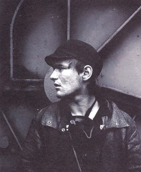
Smith’s Dock. Ian Macdonald ©Ian Macdonald.

‘Smith’s Dock’ is a large showing of black and white images by Ian MacDonald. The images were taken in 1986 and 1987 when the dock closed. All images were printed by MacDonald, some, the larger ones, were processed in his bath. Beautiful strong black and white images jump off the walls.

This part of the festival is being held in the large HIP gallery on the lower floor of the shopping centre which is set up as a proper gallery. Very well worth a visit. There are a few here I would like to hang on my walls.

hull9

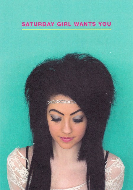
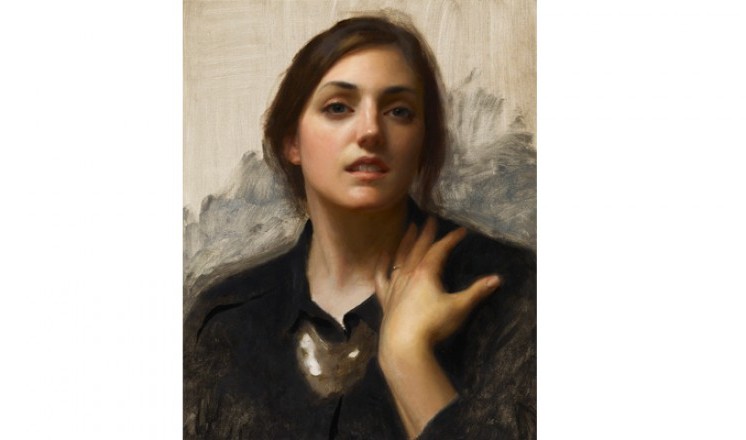
Saturday Girl © Dr Casey Orr


‘Saturday Girl’s’
is an exhibition of large colour portraits by Dr Casey Orr, Photographer and senior lecturer at the School of Art and Design, Leeds Becket University. The images, all taken in a pop-up studio, are of girls in Hull. Some images are strong and haunting,though for my taste the double-light highlights in the eyes is a little disconcerting when up close. The exhibition is on the main deck of Princes Quay.

‘Coming Home’ is a group showing, 13 photographers strong, whose “Practise resonates around ideas of home, lifestyle, family, friends and environment” to quote the Festival Guide. The showing is being held on the Main Deck of Princes Quay. For me, the outstanding image in this set was of a tower block shown as a whole but printed as a diptych half and half above and below.

hull5

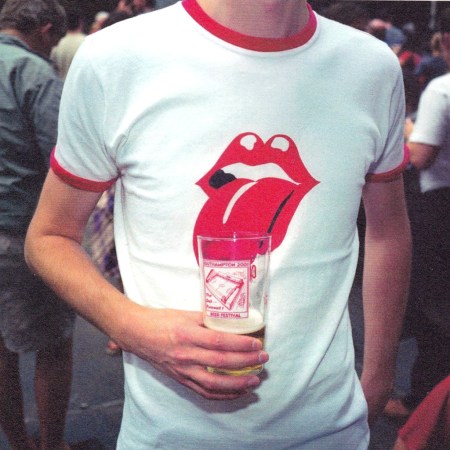
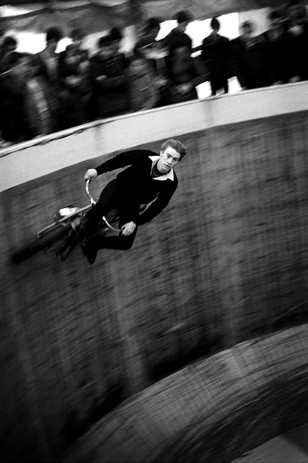
Alcohol and England ©Peter Dench

‘Alcohol and England’, a showing by Peter Dench, is an exhibition about alcohol consumption in the UK. It shows, mainly, the young in the grip of Bacchus. Some are hard to stomach, literally, showing the imbibers and their piles of lurid vomit.

The work is up close and personal and uses flash. Strong images. This exhibition is being shown on the Main Deck of Princes Quay.

The last showing in the Princes Quay centre is the ‘Travel Photographer of the Year’ (TPOTY). Visit www.tpoty.com to see some of the work in this show. This is much as you would expect. Very ‘National Geographic’ in the main. Saturated, ultra sharp images of exotic places and people and of course, the odd cute animal.

hull-1

Travel Photographer of the year Exhibition 2016

n.b. because the exhibits in Princes Quay  are staffed by volunteers you need to check whether they are open for your visit. Some don’t open until later in the day.

We then move to Hull Central Library.

hull7

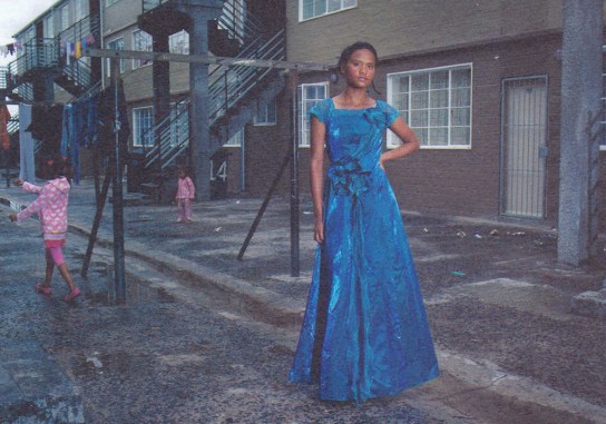
Ghetto Prom ©Ilvy Njiokiktjien

‘Ghetto Prom’ by Ilvy Njiokiktjien is a series of strong colour images from the gang-ridden area of Manenberg in Cape Town, South Africa. The images all relate to young people about to attend their senior prom. Some very moving images of hope in a bleak environment.

This set of images is being hosted in a general library area which makes some of them difficult to get close to.

hull2

Ghetto prom Exhibit. Hull central Library 2016

hull6

Unsettled ©Isabelle Pateer

‘Unsettled’ is a series of images by Isabelle Pateer. The exhibition focuses on an area of Antwerp in Belgium where the expansion of the local port is transforming local areas, and how those transformations are affecting the young in particular.

Unsettled exhibition Hull Ventral Library 2016

The exhibition is beautifully hung in the exhibition room at Hull Central Library. It benefits from being in a purposed room. The images hold together in their groupings. it’s a sign the photographer is well used to staging exhibitions. You get the feel of a ‘real show’ where the whole is considered and displayed to the advantage of both the artist and the viewer. Very well worth a visit. Probably the best exhibit at the festival.

‘HIP club exhibition’. A series of pictures held in the children’s library area at the Central library. The works were hung far too high to be readily readable and enjoyed. I skipped it. Sorry.

There were some other works hung in the cafe at the library. Because the cafe was full of customers and the works were hung on the walls behind them it made it impossible to inspect and admire the pictures as you would be intruding on those sitting at the tables. Wasted images I felt. I don’t remember one.

Lastly to the Kardomah, a cafe come theatre in the city which held The Creative and Cultural Open. The pictures were hung  on the walls of a small theatre.

These were pictures from local photographers. It contained cliche shots and HDR with the occasional close-up portrait. Nothing stood out for me in this exhibit .

n.b.If you are going to visit the Kardomah you will have to check there is nothing on in the theatre.

To sum up. There are 2 outstanding sets of images in the festival:-

1. The ‘Smith’s Dock’ images by MacDonald.

2.The ‘unsettled’ images by Pateer.

Even if these are the only exhibits you went to the festival for it would be worth it.

The festival runs from the first of October 2016 until the 30th October 2016. If you need details of opening hours contact:

HIP gallery Hipgallery.co.uk

admin@creativeandcultural.com

I strongly advise you make contact before you go regarding what’s open and opening hours etc as the impression I got was that it was a bit hit and miss, depending as it does on volunteers.

Hull city centre is in a state of upheaval with many roads being renewed and it’s having a general wash and brush up to get the city ready for when it becomes The City of Culture 2017. That upheaval makes it awkward to visit the various, scattered venues for this festival. It could perhaps have been better had there been a street map included in the otherwise excellent festival guide.

Once a year: Homer Sykes

Once a year: Homer Sykes

Photographer: Homer Sykes
Book title: Once a year.
Published: 2016
Size: 240mm X 295mm X 25mm (Portrait format)
Weight: 1572g
Pages: 160 pages of images – some double spread. Plus 42 pages of explanatory text on images.
ISBN: 978-1-911306-03-0
Purchase price: £30.00 UK
Publisher: Dewi Lewis Publishing
Website: http://www.dewilewis.com

A fascinating and insightful look at the peculiarities of the British in the 1970’s.
Are we any different now?

In this book, Homer travels the country documenting arcane events which, as the title suggests, only happen once a year. If you are interested in documenting the British this is a splendid book to purchase. The pages cover events from January to December spread over a few years in the 1970’s. The resulting images document the strangeness of the British, mainly English, and also reveal life as it was lived 40 years ago.
The style is photojournalistic with a strong nod towards ‘Picture Post’.
A lovely nostalgic book.

Coincidentally I had covered the Haxey Hood  – the event on the first page – some 40 or so  years after Homer was there.You can see some pictures from that trip here.

Note: A special thanks to Si Barber  for pointing me towards this book.

Peter Barton 2016

 Once a year: Homer Sykes