Latest Posts

Minox sub-miniature camera.

Minox was designed and first made in pre-war Latvia by Walter Zapp , a Baltic German. The company made cameras during the war finally moving to Wetzlar, Germany post war.

Though originally designed as a camera for everyman, the high manufacturing cost moved it into the luxury camera market. Of course, we see it more now as a spy camera. Indeed it featured in many a spy film and in reality it was heavily used by  secret services across the globe.

It was a very small camera for its day with an excellent lens and close focus ability, making it perfect for document photography. The negatives being only 8mm X 11mm are tiny and could be easily hidden. The perfect spy camera in fact.

The model shown here  was made in the mid 50’s. It’s missing its carrying chain. The chain was a vital feature as it’s length was set at the perfect focusing length for document photography.

The film comes in a cassette. It’s easy to load and unload. Because of  the small size of the cassette and film special developing spirals and tanks  were required.

Back in the early 80’s, this was the first camera I bought to collect and not to use. It probably started my obsession with German cameras too.

If you want further details on the continuing story of Minox there’s a good wiki page here… 

Masterji of Coventry

Jason Scott Tilley, a photographer from Coventry, first properly heard of Masterji from his daughter Tarla Patel, though he had seen him around previously as they shared the same processing house.

Subsequently, working with Masterji and his daughter what Jason discovered was a photographer, previously little known outside of his own community in Coventry, together  with a fascinating collection of pictures providing an insight into the migrant South East Asian community in Coventry reaching back into the 50’s.

Maganbhai Patel, better known as Masterji migrated to Coventry from his native Gujarat, Indias most western state,  in the 50’s. Keen to follow his passion for photography he set up a studio in his house and started to produce images of his family and friends within his community.

You can read here the full background on Masterji written by the curator and producer of this exhibition, Jason Tilley. It’s a heartening story about one man’s passion for photography.

The exhibition I visited -now closed – showed 100 or so prints, some in colour, of people in this community, some dating back to the early 60’s. Over the years Masterji and his wife have disposed of much of his stock of negatives. ‘They needed the room’ says Jason. Jason suspects tens of thousands of images have been consigned to the waste bins. A sad loss in my opinion. What remains are images in which Masterji has an invested emotional tie.

“He retained these images because they are important to him.”
Jason Tilley 2016

Together with Masterji’s daughter, Tarla Patel, herself a photographer, Jason spent hours washing and cleaning negatives before printing them in the darkroom for this exhibition. The result is clear. The effort was more than worth it. A fine set of images  defining an era which would have otherwise been lost to us has now been saved and made public.

This slideshow requires JavaScript.

Masterji’s style has been described as ‘playful’. For me it’s more naïve, perhaps deliberately so, akin to LS Lowry in its simplicity. There is no artifice. No obsession with precise lighting, nor with the ultra-sharp perfect images we see today from the gear obsessed self-described photographers. Just people being shown as they wished to be seen. There is something refreshing about the images. They are one man’s view of the community in which he lives. And as such are a rare insight. An insight without the filter of pretension.

The exhibition in Coventry closed yesterday the 20th November. I understand the work has been accepted for the Focus Photography Festival in Mumbai 9-23 march 2017, the theme of which is Memory. Which seems very apt don’t you think? And who knows where else it may go? What I do know is it’s worth seeing. Especially if you want your photographic compass re-setting.

Lastly, if there is a book being produced from this show then put me down for an early copy.

PDBarton November 2016
All images unless otherwise stated are copyright Masterji 2016.

Did it all really start from here…

It’s hard to imagine but the magnificent digital cameras of today started out from this very humble Casio of  1995. Yes! 1995. Only 20 years ago.

Odd too isn’t it the manufacturer of the first consumer digital camera  with an LCD screen was more synonymous with calculators than with optical equipment.

The Casio QV10, by todays standards was an appalling device. Many people accused it of being very badly designed with bad software and even worse results but, at the time it was the proof of concept that was required to take digital imagery forward.

Yes, even by standards of the day the result compared very badly to even those from a cheap film camera. And the cost! I remember buying one and wondered at the time why I was wasting my money on something so bad and expensive.

For it’s day, so formative and important was this camera that Japan’s National Museum of Nature and Science branded it as being…

“Essential historical material for science and technology”.

I remember being scoffed at by a photographer with a large photographic business and him saying “It’ll never catch on”. How wrong he was. Perhaps that’s why he’s not in the business today.

The camera had a 250 Kilopixel CCD and a 1.8inch screen and was powered by AA batteries.

Yes it was primitive but OH MY! did it prove the concept. And did it prove there was a market? Did it ever!   And look where we are today.

Book review: Humphrey Spender’s Humanist Landscapes

Title: Humphrey Spender’s Humanist Landscapes
Author: Deborah Frizzell
ISBN: 0-300-07334-8
Softcover: 70 pages of introduction plus 100 plates
Images: 100
Publisher: Yale centre for British art
Language: English
Product Dimensions: 28 x 1 x 23 cm Landscape format.

As a precursor to Spenders images Frizzell, the author, discusses where the images sit in the panoply of images of the time and of the era in which they were made, providing, as she does, social and historic reference for the works.  Some 70 excellent  pages are taken up with this explanation.

To set the scene: Spenders images span the decade 1932 – 1942. He came from a a middle class family in fashionable Kensington. His father, Harold was a Journalist and his mother Violet Schuster was a painter and poet. His brother Stephen, later to become Sir Stephen Spender, became a poet and essayist who concentrated on themes of social injustice and the class struggle in his work. Stephen Spender was close friends with many famous literary figures from the time i.e. WH Auden. Clearly the sensibilities  of his family and friends influenced Humphrey’s work.

The age in which he worked was also remarkable for the documentary style of film and photography which started in this decade. For example, in 1938 Picture Post was first published. it fast became the most popular weekly illustrated magazine soon achieving a circulation of  over 1 million. Humphrey joined Picture post at it’s birth in October 1938 together with other like minded and talented photographers, Bill Brandt being just one.

The second half of this book contains 100 plates, all in black and white of course, showing Spender’s pictures from around the country and all taken in the decade 1932 – 1942

The pictures contain a heavy dose of nostalgia, at least for me. Being born in the late 40’s I remember much of the what I see in this book. Yes there were stylistic changes but the ‘feel’ of the country remained the same. And of course being from Birmingham I love image number 79 of Navigation St Birmingham. I have strong recollections of it being just so.

This book has the ability to plunge me, and I suspect other readers, into a very personal past but, that is not it’s only charm. The pictures are strong, well composed depictions of a past now gone. Of course they are viewed through the eyes of a person largely outside of the social classes which the pictures depict. But, in saying that, they are not cruel. The working people are pictured with sensitivity.

This book is well worth a place on any photographers bookshelf.

I’d like to thank David Barrett for the loan of this book. Much appreciated. I thought it so  good I sought out my own copy from America.

David’s own excellent web site is here.  ukstreet.photography

India 2007

If I were to have only one of my images of India this would be it. I know it’s not too sharp and a it’s little grainy, but, this picture of modern schoolgirls around the pool of a Sikh Gudwara in Delhi encapsulates India for me.

Yes there is tradition; Yes there is religion; Yes there is a vibrance of colour, but there is also modernity. Girls at school, in uniform, with schoolbags.

I took the picture in 2007 on our first trip to India. It was made with an inadequate camera – at least judged by the fashion for ultra sharp images of today,  but still it has an enduring quality. It tells a story, even in its singularity, of a nation moving forward. It tells of the importance of religion in this country of over 1.3 billion people, and, it gives a sense of the visual excitement I felt as a westerner. I know it’s not perfect but hey…it’s my wife’s favourite picture. Say no more.

Book review: Street The Human Clay. Lee Friedlander

This excellent review by John Meehan kicks off a series  of posts by guest publishers.

Hardcover: 224 pages
Images: 209 duotones
Publisher: Yale University Press (4 Oct. 2016)
Language: English
Product Dimensions: 28.7 x 2.5 x 24.9 cm
Price paid: £40.50 (from Amazon, UK)

_________________________________________________________________

Lee Friedlander’s Street The Human Clay is the third in a projected six book series entitled ‘The Human Clay’ published by Yale University Press started in 2015. Each title in the series gathers together images of people grouped thematically. So far we have seen a volume on Children and one of Portraits.
Read More

Exhibition Review: Feminist Avant-Garde of the 1970’s

The Photographers Gallery
16-18 Ramillies St
London W1F 7LW

W: The Photographers Gallery 
E:   info@tpg.org.uk
T:   +44 (020) 7087 9300
Opening hours:  Mon – Sat 10.00 – 18.00, Thu 10.00 – 20.00 during exhibitions, Sun 11.00 – 18.00

Admission to Exhibitions:
Exhibition Day Pass £4 (£2.50 Concession)
Advance Online Booking £2.50
Free admission before 12.00 every day

Title of Exhibition: Feminist Avant-Garde of the 1970’s
Exhibition run:  from October the 7th 2016 until  15th January 2017
Website for the exhibition: Feminist Avant-Garde of the 70’s


screen-shot-2016-10-30-at-12-23-32To get a clear idea of just what this exhibition is about you can watch an interview with Gabriele Schor, Director of the VERBUND Collection and Anna Dannemann, Curator, The Photographer’s Gallery here… 

In this interview, Schor talks about her thinking behind the collection. She makes it clear the Verbund chose the budget and she chose the art.

And Dannemann talks about how she curated the exhibition and her decision process related to the layout of the art in the galleries.

Dannemann says of the exhibition…

“Focusing on photographs, collage works, performances, films and videos produced throughout the 1970s, the exhibition reflects a moment during which practices of emancipation, gender equality and civil rights protest movements became part of public discourse.”

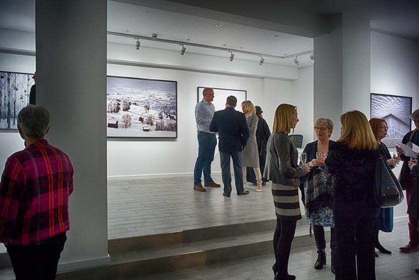
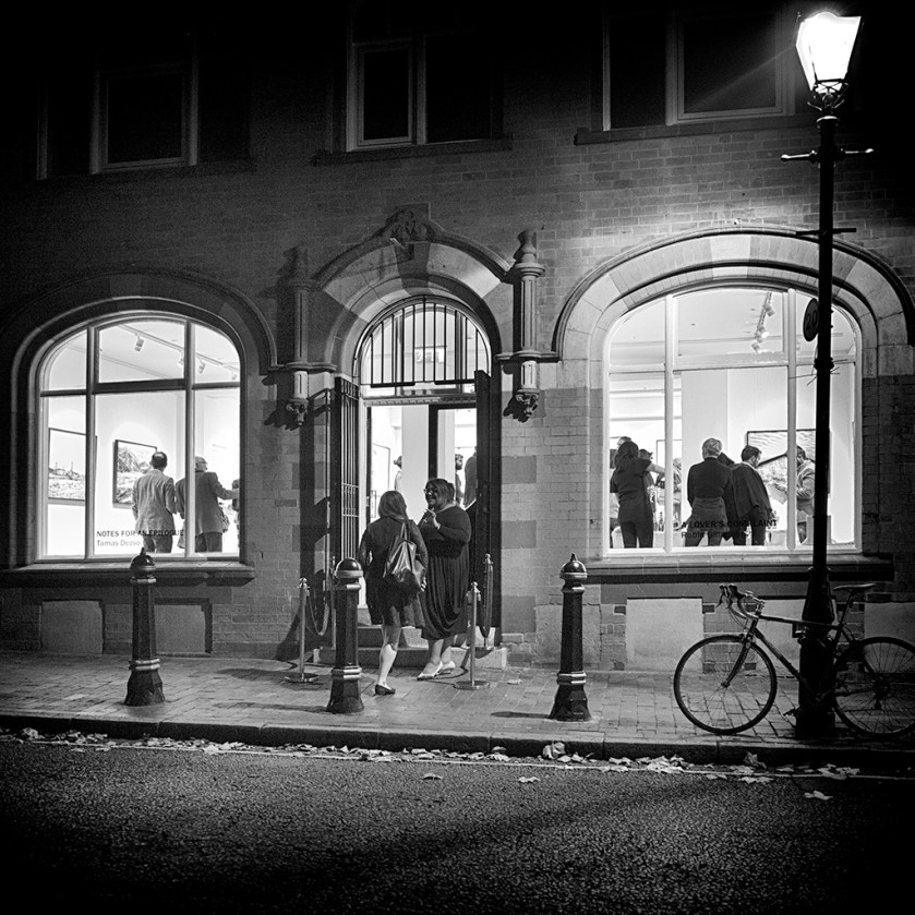
So, what was it like to experience the exhibition?

The works range from the beautiful work of Francesca Woodman to the aggressive feminism of the day illustrated by the, frankly shocking, image of a pudendum with a tampon being removed in Judy Chicago’s ‘Red Flag’. I have deliberately chosen what I see as the extremes of the exhibited works.

Woodman used herself as the main subject for her art. She often created ethereal images in black and white, using movement and long exposures to produce dreamlike exposures relating to time and space and the self as it passes through both. Elegant and compelling small images theme her work. The sadness is she took her own life aged just 22. Her last journal entry, January the 19th, 1981  read…

“I was inventing a Language for people to see…”

You can see some of her work collected by the TATE here…

If you wish to read more about Woodman see here…

And of her work “Red Flag” Chicago has said

“I wanted to validate overt female subject matter in the art community and chose to do so by making “Red Flag” as a handmade litho, which is a high art process, usually confined to much more neutralized subject matter. By using such overt content in the form, I was attempting to introduce a new level of permission for woman artists. It really worked.”

I can only evaluate the exhibition from my viewpoint. That is seeing it both as a man and viewing it outside of the time signature for the works here in 2016, some 40 years past the making of the images. Clearly, I’m not observing as a woman in the 70’s. Do the works hold up in the context of today?

Some, like the works of Woodman, are timeless. On the other extreme some, like the works of Chicago have little else to give them merit other than the zeitgeist of  when the images were made. I found them aggressive, unnecessarily so.

Curiously the picturing of the female form found often in this exhibition seems – not just to me but to women I have spoken to about the exhibition works – to be opposite to feminism.  Where are the pictures of Rosa Parkes, Maya Angelou  and their like?  And heaven forfend, even Margaret Thatcher? Feminists, activists, strong women. Perhaps that’s a too simplistic, male interpretation on my part.

This exhibition is likely to polarise opinion. And the dividing line may not be easy to forecast.

Should this put you off from going to the exhibition? No. On the contrary. These are important pictures of their age, just as those by Vivian Maier, and should be judged as such. And, as such, should be seen by all.
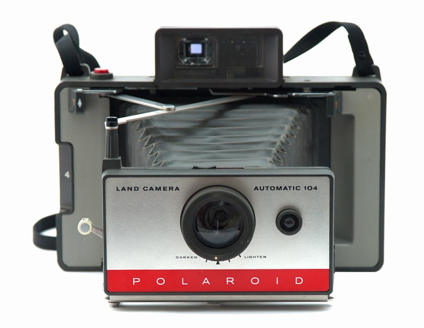
Opening night at the Argentea Gallery, St Pauls Birmingham

New photo gallery opens in Birmingham.


gallery1

Private viewing on opening night.

The Argentea Gallery opened for business in St Pauls Square in the heart of Birmingham’s Jewellery Quarter. Not, as you might think to sell jewellery but to exhibit contemporary photography.

Set at the top of this refurbished 18th and early 19th century square with St Paul’s church at its centre the gallery fits in with re-purposing of the square’s fine buildings. It’s perfectly positioned to bring added culture to this fine square.
Read More

Snapped by a street photographer

I am not a street photographer.

In an e-mail conversation with John Meehan, a founding member, contributor and the editor of the f50 collective, I was rambling on, attempting to explain why I am not a ‘Street Photographer’.   John asked me to flesh  out my view a little and publish, so here it is.

I’ve never been happy calling myself a ‘Street Photographer’. There’s something about the term that makes me shudder – especially when the short form ‘togs’ is used. I’m old enough to remember street photographers at seaside towns and in cities across England.
See the image above. My great Aunt and her family ‘Snapped’ by a street photographer at a seaside resort.

Read More